Explaining his addition to the Isabella Stewart Gardner Museum, Renzo Piano called the Venetian palace “the constant object of your desire . . . you never lose it.” At the Fogg Art Museum, he approached the arcaded courtyard in much the same way, said Maureen Donovan, deputy director of the Harvard Art Museums: “It’s always in your mind, you’re always seeing it. Everything leads back to the courtyard.”
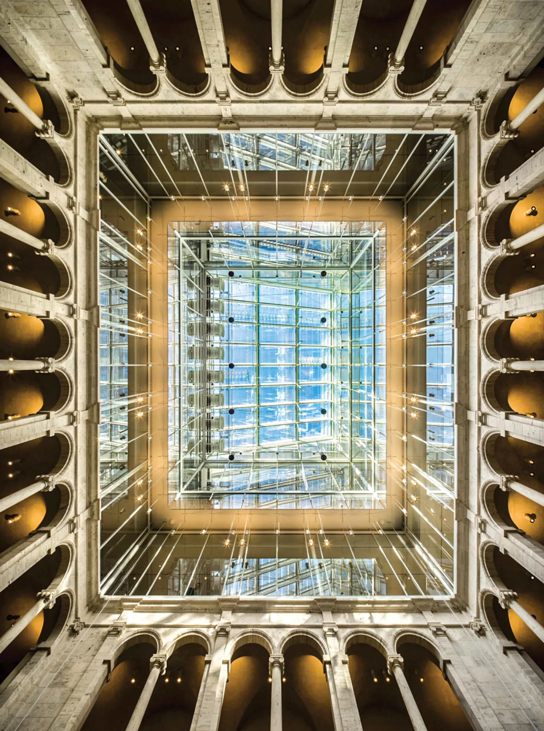
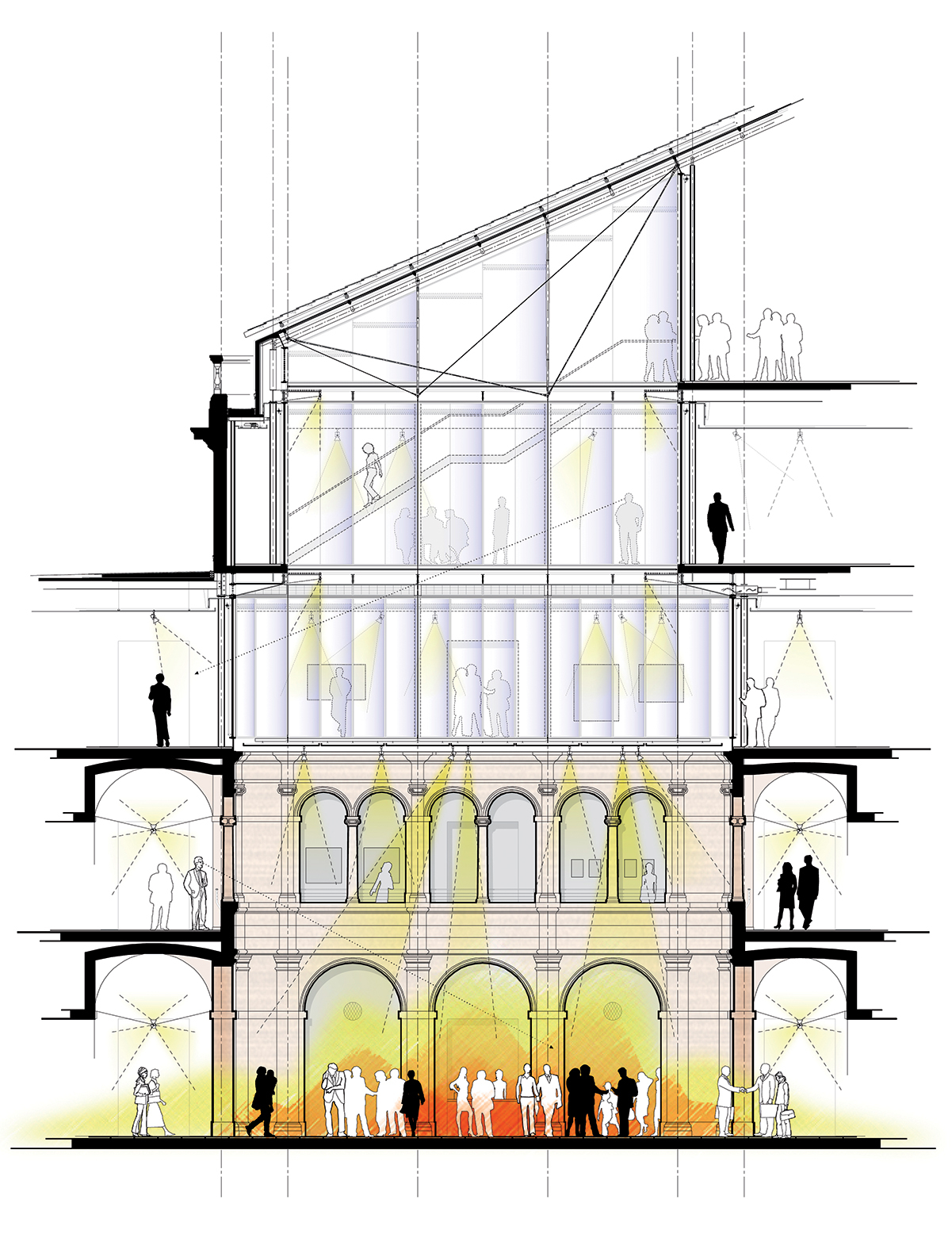
Like the Gardner, the Fogg courtyard was an intimate Italian reproduction, in this case a horizontal Renaissance rectangle topped by a translucent laylight. Piano’s 2014 renovation and expansion removes the third story, adds three stories to the remaining two, and walls the interiors of those three in glass. The resulting stack is capped with a clear, dramatically angled skylight to form a spectacular atrium.
The problem is volume. Stacking a tower on top of a Renaissance plaza flips the horizontal space on its end. Where once your eye was pulled across the quadrangle to the arches, it is now pulled up to the gleam of the tower. Where once you were a person in a square, you are now a bug at the bottom of a five-story shoebox. The vertical space is no longer human-scaled, and the floor of the courtyard — unchanged in size at 55 by 42 feet — feels cramped.
As awkward as the volume is the materiality, especially when viewed from upper floors. From above, the historic arches look rather pitiful in their glass-and-steel well, like the little clapboard house whose owner refuses to vacate as skyscrapers go up around her. They have themselves become artifacts in a glass display case.
Everyone involved with this project, however —the museums, Renzo Piano’s team, and the Cambridge and Massachusetts historic commissions — identified the problems of volume and materiality at the outset. And, far from being blithe or insensitive, they spent years trying to solve them.
In the 1920s, charged with imposing some architectural unity on Harvard’s diversifying campus, Charles Coolidge, of Coolidge, Shepley, Bulfinch, & Abbott, painted broad strokes with a red-brick Georgian brush. The Fogg (1927) was no exception — but indoors, eclecticism reigned. Partner Henry Shepley found a model for the courtyard while traveling in Italy: the two-story canon’s house at the Church of San Biagio (c. 1534), in Montepulciano, designed by Antonio da Sangallo the Elder and clad in travertine. To form an enclosure, the architects copied the house’s façade four times at four-fifths scale.
The glass roof over the Calderwood Courtyard brings controlled natural light into the museum’s core.
A battle then broke out over travertine cladding on the arches. Harvard president A. Lawrence Lowell pushed for plaster, holding that imported stone, at seven times the cost, was an unseemly luxury, explains Kathryn Brush in her book Vastly More Than Brick & Mortar: Reinventing the Fogg Art Museum in the 1920s. But Fogg president Edward W. Forbes, “on both aesthetic and pedagogical grounds . . . vehemently opposed a plaster finish,” Brush writes. “He argued that it would not only cheapen the look of the central architectural feature of the new art museum, but that its inferior quality and falsity taught values that were inappropriate” for Harvard’s art department. Lowell agreed only when Forbes secured financial guarantees. Fascinatingly, “Forbes’ memoirs record that he regarded the hard-won battle for travertine . . . as one of his greatest contributions to the fabric of the building.”
The model had no third floor, but the Fogg needed classroom and studio space. In the courtyard, “The architects configured the additional storey as a simple attic,” Brush writes, with plaster walls and small, travertine-framed windows. “Above, they placed projected rafter ends that fictionally supported the eaves of sloping roofs covered with Mediterranean tiles. The projecting eaves . . . were designed to halt the eye before it reached the glazed ceiling.”
And there it is: the original solution to the volume problem. As quirky as the tiles now seem, they, along with the laylight, finished the courtyard, framed the rectangle. How, in the 21st century, could that effect be retained when the Fogg ballooned from one museum into three?
The first thing Piano’s team wanted to do was blow out the plaster walls. Justin Lee, project architect, recalled, “We looked at it and said, for construction reasons, we cannot keep and don’t want to keep the plaster [level 3] façade; and we don’t think it works well with the travertine.” But lopping off level 3 would truncate the building’s historic base even as its program headed upward. The city and state historic commissions resisted “changing the proportions of a significant space,” said Charles Sullivan, executive director of the Cambridge Historical Commission. Ultimately, said Lee, the design team was asked: “How do we preserve the memory of the room?”
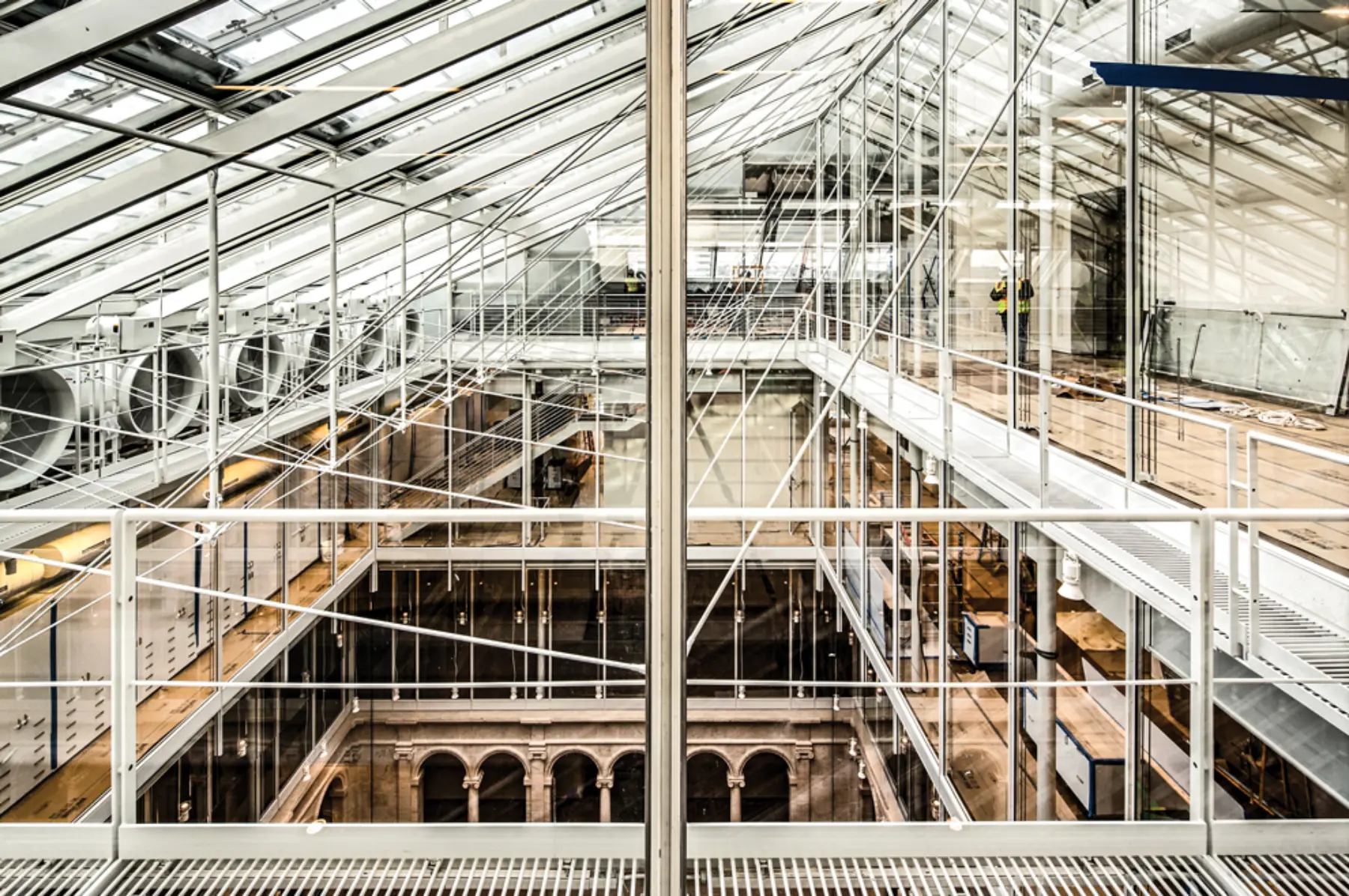
So Piano suggested a fabric scrim across the courtyard, which would separate the Renaissance plaza both spatially and materially from the coming glass tower. Elisabetta Trezzani, a partner at Renzo Piano Building Workshop, said the concept was simply a version of the laylight: “It was part of an element that we needed to keep, so we started design with the kind of scrim that was [there] before.” Tom Lentz, then director of the Harvard Art Museums, concurred. “From the beginning,” he said in a June interview, “Renzo’s idea was to re-create that kind of floating plane above. I’d seen his scrim systems . . . in other building projects, and I think I was intrigued.” The trouble with fabric was keeping it clean: “We talked about maintenance issues so many times that at one point Renzo referred to me as ‘the cleaning lady.’” They considered a retractable shade, but that seemed cumbersome. They moved on to metal mesh, “trading lightness for permanence,” said Lentz.
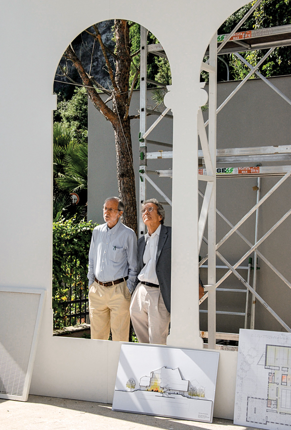
Lee showed me a rendering of a metal-mesh scrim in the courtyard, seen from ground level. Light sparkled through it as if from the heavens. Based on that image, Piano’s team, in their Genoa, Italy, garden workshop, fashioned plywood into a full-scale bay of second-floor arches and projected a metal scrim from the top. “We actually used the real material, stood underneath it, and played with different porosities,” Lee said. They added working light fixtures.
Renzo Piano (left) and Tom Lentz at Piano’s outdoor workshop in Genoa, Italy, where full-scale mockups are built. Lentz is looking up at a scrim (not visible). On the ground is a section drawing that shows that variation. Photo: RPBW, Stefano Goldberg, Publifoto.
But volume and materiality were always at odds. A scrim above level two would separate stone from glass, but the space would feel squat. A scrim above level three would maintain the old volume, but the museum wanted glass for third-floor galleries, and a scrim that high would hit the glass tower in its middle. In addition, Lentz said he was always a bit skeptical of how a scrim would scan from above. Lee showed me a rendering of the scrim from an upper floor; it looked like a tarpaulin.
Finally, after two or three years, everyone came to the same conclusion. “We talked so much about transparency, especially about potential sight lines between different things,” said Lee. “And the scrim, even though it’s transparent, it’s still kind of cutting you off. So we started looking for another way to conserve that sense of the volume without the scrim.”
They never found one.
Scaffolding filled the courtyard for three years, hiding the arches while the building was demolished and rebuilt around them. Everyone remembers the day it came down. “I think we all wondered what it would be like to have that big volume,” Donovan said. “Would it be too much, would the light be too much?” Lentz said the choice to scrap the scrim was “validated” the moment the rigs were removed: “It was literally as if everything in the building clicked into place around the courtyard.” Trezzani was there, too, and remembered how “everybody was coming into the space, saying [with laughter], ‘Are we sure about the scrim now?’”
Today, the arches are sewn to the glass by subtle articulations on level three: Narrow mullions align with the travertine piers, pulling their rhythm upward before giving way to uniform panes on levels four and five. A small soffit above level three hints at the volume of yore. In practice, these are an intellectual exercise. Most eyes will not notice them.
Now activated both vertically and horizontally, the Calderwood Courtyard is no longer the restful space it was. The new Prescott Street entrance gives circulation a pleasing symmetry, but the new, north-side ticket desk clutters it: People walk in, look up toward the light, and get in line. Ann Sussman, coauthor of Cognitive Architecture: Designing for How We Respond to the Built Environment, said, “Looking up takes extra energy . . . and when you look up, you still think about what’s going on around you. So it’s very dynamic.” Before, the courtyard “was a point of arrival. Now it’s a point of transition.”
It was never quite feasible to maintain the human scale here. Driven skyward by an unwieldy program, the tower was designed to impress — and it is mesmerizing, especially the top-floor conservation aerie. Sullivan, whose historical commission gave the museums a preservation award for their efforts throughout the building, said, “The travertine walls were preserved, but the original architect’s conception of that space has been destroyed and replaced by a different conception. And time will tell if that is as valid as the original.” More likely, time will not remember the original.