More years ago than we can remember, we created a regular column for The Boston Globe called Cityscapes. Each column featured two pictures. One was a view of a Boston scene as it had looked at some point in the past. The other was a photo we made of the exact same scene as it looked in the present. We’d write a few comments comparing the two. We tried to figure out whether, over time, the scene was getting better or worse, and what lessons could be learned.
The theme for this installment of ArchitectureBoston is “Lost,” and loss was something a lot of our Cityscapes readers thought was happening to Boston. Admittedly, the old pictures usually looked better than the new ones. That was predictable, since they’d been made in the first place because someone admired what they depicted. The new views didn’t have that advantage. But beyond that, there did seem to be a genuine loss of something.
Peter began making “then and now” images with Sinclair Hitchings of the Boston Public Library in 1976. Intrigued by these, the two of us then made an informal list of some of the enduring qualities of good architecture and urbanism that we could see in the old work but seldom in the new. Here’s that list, unedited:
- The old city, it appears, was superior to the new in grain, human scale, continuity, urban space, and a quality we call “face.” The new city is superior to the old in comfort, convenience, and visual drama.
- Grain is the pepper and salt of small detail—signs on the building fronts, for example. And it’s also the frequent (but not too big, not dramatic) variation in building height and style.
- Human scale is the sense the old buildings convey that they’re places for people. Their windows, doors, awnings, stoops, and decorative elements are person-sized.
- Continuity means the way most of the architecture emerges from the same general classical tradition that provides elements that carry over from one building to the next, knitting them together into one city fabric: roof cornices, windows expressed as framed rectangles punched into the building wall (so different from the glass strips or skins of recent years), rustications, and solid masonry as the basic material.
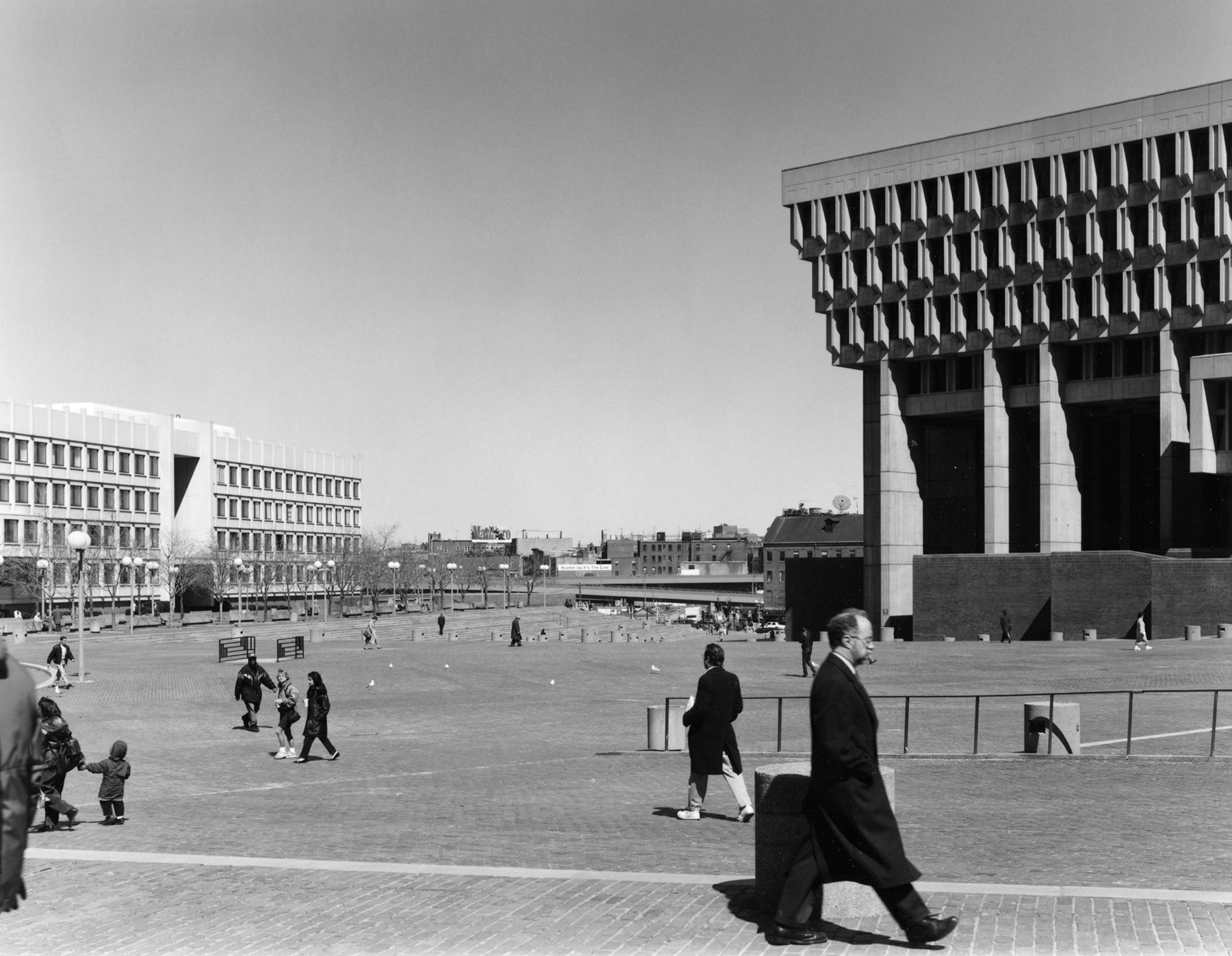
- Urban spaces are all those outdoor rooms—streets as corridors, squares as parlors—that made the pedestrian city one huge, diverse social club. In the automobile city, urban space is often shapeless, and buildings are not its walls but merely objects within it..
- Face is harder to define, but you can’t miss it in the old images. The buildings are humanoid: Windows suggest, as eyes do, intelligences behind them looking out; buildings have tops and bottoms like hats and boots. Lined up and jostling one another like seniors at their class portrait, they smile and frown across the street space. Even the old carriages and upright cars have more face than the sleek, low autos of today. Face makes the city more social, more alive. It’s something very different from the graph-paper façades or hulky robotic presence of many of Boston’s recent office towers (which people often call faceless).
Our list was a product of its era, circa 1980, and it leaves out a lot. But the qualities it describes are still relevant. They have little to do with changing fashions or periods in architecture. If we were making such a list today, we’d add at least one item. Both of us were and are fans of the theorist Christopher Alexander and his concept that cities and other communities are best when they grow and change in small increments over time, rather than in broad swaths of redevelopment. Boston can offer many examples of both.
Reading over this list again, we’re reminded of a quip by the architect Charles Moore. Moore said architects, especially Modernists, often spoke Esperanto. He meant that they used an invented verbal and visual language that hardly anyone else understood. They were seen as cult members with a secret language of codes and symbols. That kind of creepy pomposity has faded now, but it hasn’t disappeared. If we learned anything from producing the Cityscapes column, it was that anything you can say about architecture can be presented in plain words and images.
For this article, we’ve raided the Cityscapes photo archives for those that make some points about loss. A few of the images are new and so are all the captions. We’ve stuck to downtown Boston, an area just about everyone knows. We’re walking down memory lane, of course. But city-making, good and bad, is always timely.